 In preparation for my coursework exercise, I have spent time creating a magazine cover in the style of FHM magazine. In order to do this in a convincing way, I used the programme Photoshop to create my piece. Throughout the process, I learnt how to manage working with a number of different layers, and vastly improved my skills when working with text. For example, I learnt how to create a drop shadow behind the title of the magazine, which made the text stand out from the rest of the page. This made it look effective; however it wasn’t too much to make it look unrealistic. As well as learning how to create a drop shadow, I also learnt how to put a glow around the edge of text. This makes the main headline on the front of the magazine stand out, and by also adjusting the spacing between the letters as well as the spaces between each line on all my text, I think that all of the headlines look realistic. In order to make sure that my interpretation of the FHM magazine cover used similar codes and conventions to the actual magazine cover, I looked at several copies to gain an understanding of how they arrange their headlines, as well as ideas on the kind of fonts they use, the font colours, and the type of headlines that are featured in order to target their specific audience. From looking at past magazine covers, I found that mainly bold fonts were used, with bright block colours, and usually only two or three colours were used on each cover. As well as this, I found that shadows and glows around the text were used in order to make the text stand out to the reader. This links in with Louis Althusser’s theory of interpellation, where the media shouts out to you, and the magazine does this through the aspects used on the front cover. By using bold colours and effects such as subtle drop shadows, the text looks as though it physically stands out from the page, which attracts the attention of the audience, who then read the rest of the text on the cover of the magazine, and through the cycle of investment, are then inclined to buy the product. In order to use the correct codes and conventions for my own cover of FHM, I looked at the kind of headlines that were featured on the past issues that I looked at. Common features of the past headlines were women, music, films, gadgets and fitness, and so to stay in keeping with this, I decided to use some of these as the ideas for my own headlines. The past headlines also had a relaxed and jokey nature to them, and so I tried to stay in keeping with this aspect as well. For example, by putting the headline “Getting hitched?!...” it could be argued that it is seen as a jokey idea for a reader of this magazine to get married, as he will then no longer be single, and as a consequence will no longer be able to do ‘laddish’ things. As well as headlines having a jokey nature to them, they also had headlines relating to women which had sexual implications. For example my main headline “Bianca Gascoigne reveals all...” has sexual connotations as well as its literal meaning. Headlines like this feature on the cover of this magazine as the targeted audience is heterosexual men. The only thing I am slightly unhappy with and would change in the future is the colour of the text for some of the headlines. Although I think white was a good colour to use for some of them, it is still difficult to read some of the headlines because of the colour of the background. To change this in the future, I would find a suitable colour that would stand out from the background, but would also work with the colour scheme, and also the theory of interpellation.
Thursday, 26 November 2009
Practice at making a magazine cover
Go to the FHM website
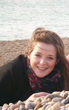
 In preparation for my coursework exercise, I have spent time creating a magazine cover in the style of FHM magazine. In order to do this in a convincing way, I used the programme Photoshop to create my piece. Throughout the process, I learnt how to manage working with a number of different layers, and vastly improved my skills when working with text. For example, I learnt how to create a drop shadow behind the title of the magazine, which made the text stand out from the rest of the page. This made it look effective; however it wasn’t too much to make it look unrealistic. As well as learning how to create a drop shadow, I also learnt how to put a glow around the edge of text. This makes the main headline on the front of the magazine stand out, and by also adjusting the spacing between the letters as well as the spaces between each line on all my text, I think that all of the headlines look realistic. In order to make sure that my interpretation of the FHM magazine cover used similar codes and conventions to the actual magazine cover, I looked at several copies to gain an understanding of how they arrange their headlines, as well as ideas on the kind of fonts they use, the font colours, and the type of headlines that are featured in order to target their specific audience. From looking at past magazine covers, I found that mainly bold fonts were used, with bright block colours, and usually only two or three colours were used on each cover. As well as this, I found that shadows and glows around the text were used in order to make the text stand out to the reader. This links in with Louis Althusser’s theory of interpellation, where the media shouts out to you, and the magazine does this through the aspects used on the front cover. By using bold colours and effects such as subtle drop shadows, the text looks as though it physically stands out from the page, which attracts the attention of the audience, who then read the rest of the text on the cover of the magazine, and through the cycle of investment, are then inclined to buy the product. In order to use the correct codes and conventions for my own cover of FHM, I looked at the kind of headlines that were featured on the past issues that I looked at. Common features of the past headlines were women, music, films, gadgets and fitness, and so to stay in keeping with this, I decided to use some of these as the ideas for my own headlines. The past headlines also had a relaxed and jokey nature to them, and so I tried to stay in keeping with this aspect as well. For example, by putting the headline “Getting hitched?!...” it could be argued that it is seen as a jokey idea for a reader of this magazine to get married, as he will then no longer be single, and as a consequence will no longer be able to do ‘laddish’ things. As well as headlines having a jokey nature to them, they also had headlines relating to women which had sexual implications. For example my main headline “Bianca Gascoigne reveals all...” has sexual connotations as well as its literal meaning. Headlines like this feature on the cover of this magazine as the targeted audience is heterosexual men. The only thing I am slightly unhappy with and would change in the future is the colour of the text for some of the headlines. Although I think white was a good colour to use for some of them, it is still difficult to read some of the headlines because of the colour of the background. To change this in the future, I would find a suitable colour that would stand out from the background, but would also work with the colour scheme, and also the theory of interpellation.
In preparation for my coursework exercise, I have spent time creating a magazine cover in the style of FHM magazine. In order to do this in a convincing way, I used the programme Photoshop to create my piece. Throughout the process, I learnt how to manage working with a number of different layers, and vastly improved my skills when working with text. For example, I learnt how to create a drop shadow behind the title of the magazine, which made the text stand out from the rest of the page. This made it look effective; however it wasn’t too much to make it look unrealistic. As well as learning how to create a drop shadow, I also learnt how to put a glow around the edge of text. This makes the main headline on the front of the magazine stand out, and by also adjusting the spacing between the letters as well as the spaces between each line on all my text, I think that all of the headlines look realistic. In order to make sure that my interpretation of the FHM magazine cover used similar codes and conventions to the actual magazine cover, I looked at several copies to gain an understanding of how they arrange their headlines, as well as ideas on the kind of fonts they use, the font colours, and the type of headlines that are featured in order to target their specific audience. From looking at past magazine covers, I found that mainly bold fonts were used, with bright block colours, and usually only two or three colours were used on each cover. As well as this, I found that shadows and glows around the text were used in order to make the text stand out to the reader. This links in with Louis Althusser’s theory of interpellation, where the media shouts out to you, and the magazine does this through the aspects used on the front cover. By using bold colours and effects such as subtle drop shadows, the text looks as though it physically stands out from the page, which attracts the attention of the audience, who then read the rest of the text on the cover of the magazine, and through the cycle of investment, are then inclined to buy the product. In order to use the correct codes and conventions for my own cover of FHM, I looked at the kind of headlines that were featured on the past issues that I looked at. Common features of the past headlines were women, music, films, gadgets and fitness, and so to stay in keeping with this, I decided to use some of these as the ideas for my own headlines. The past headlines also had a relaxed and jokey nature to them, and so I tried to stay in keeping with this aspect as well. For example, by putting the headline “Getting hitched?!...” it could be argued that it is seen as a jokey idea for a reader of this magazine to get married, as he will then no longer be single, and as a consequence will no longer be able to do ‘laddish’ things. As well as headlines having a jokey nature to them, they also had headlines relating to women which had sexual implications. For example my main headline “Bianca Gascoigne reveals all...” has sexual connotations as well as its literal meaning. Headlines like this feature on the cover of this magazine as the targeted audience is heterosexual men. The only thing I am slightly unhappy with and would change in the future is the colour of the text for some of the headlines. Although I think white was a good colour to use for some of them, it is still difficult to read some of the headlines because of the colour of the background. To change this in the future, I would find a suitable colour that would stand out from the background, but would also work with the colour scheme, and also the theory of interpellation.
Subscribe to:
Post Comments (Atom)
No comments:
Post a Comment