Objective:
To identify the codes and conventions commonly used in teaser trailers which promote films within the genres of thriller and action.
Case Study:
Cloverfield (Matt Reeves, 2008)
Cloverfield’s whole viral marketing campaign was one of the most creative developments in the use of the internet and the power of social networking in film history. It seemed to use the philosophy ‘less is more’ and by this approach the blogs and fan pages were sent into overdrive.
They essentially managed to create an enigma that captured the minds of the public. This created a buzz which reverberated across the worldwide web in an unparalleled fashion. As such, the film gained huge amounts of below-the-line promotion through word of mouth and speculation on the identity of this destructive force.
The trailer used a short sequence from the film with a few points of ellipsis used to create the timeframe required for the trailer. This differed from many teaser trailers which often skip between different significant points within the film in a manner disassociated with the actual timeline of the film. Within the sequence used there was an establishment of setting particularly when the Statue of Liberty’s head rolled down the street and an establishment of characters to a certain degree though this was very vague. Using such a limited section of the film seemed to be part of the ‘less is more’ marketing strategy as the audience was only given one point of reference within the film from which to try and answer the plethora of questions it left behind. Not even the title of the film was put in the teaser trailer, in fact only the name of the producer J.J. Abrams and the release date were given.
The camera was hand held when filming Cloverfield which acts like a constant point-of-view shot thus allowing the audiences perspective to be more subjective and thus ‘realistic’. They also only used diegetic sound within the trailer which is again fairly atypical of teaser trailers but again it does add to the verisimilitude of the trailer.
The shots often became broken and out of focus in order to denote a state of panic and confusion. The trailer relied on this confusion transferring into the audience for the enigma to be enhanced. Further techniques were employed in order to create this state of panic and confusion for example, the camera was often uneven and in the scene where they were running down the stairs it appeared to go upside down at one point during a near rolling action. In addition to this frequent cuts were used throughout the trailer which gave it a fast paced feel.
Friday, 16 April 2010
Thursday, 15 April 2010
Production Photos
These are some photos that were taken during the filming stage of our trailer.
 This photo shows how we set up the camera in order to get the framing we wanted for this shot.

 We used a wheelchair when filming this shot because it was the easiest way to make sure that the camera stayed steady and the shot was smooth. Before we filmed it, we did a few practise turns, to make sure the framing was correct.
 When filming this shot of the male protagonist walking down the corridor, we put the camera low down on the tripod to make sure we only had his feet in the frame.
 We used the same principal as the scene with the wheelchair when filming our last shot.
 This was when we recorded the voice over for our trailer. I was in control of monitoring the sound levels during the recording.
Wednesday, 14 April 2010
Website

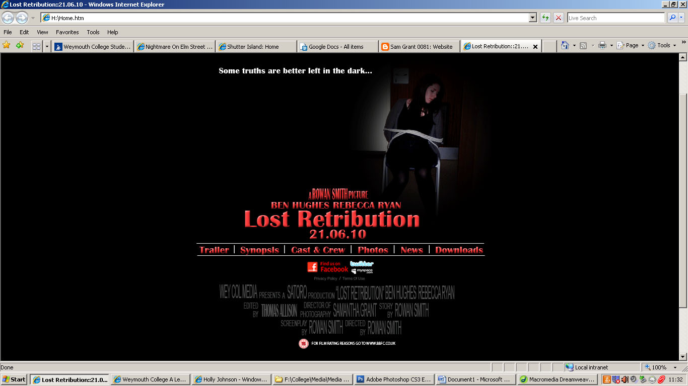
My final website (click to enlarge)
In order to complete my website, the first of the two individual coursework tasks, I had to set aside time outside of lessons. This was because the group tasks - both the trailer and the radio advert - were what our group felt were most important to focus on in class time together. I think this was the right decision as the individual tasks are much less demanding than the group tasks.
To create our websites, we used Photoshop, which wasn't much of a problem for me as I have experience using this programme within my other studies. Although this was the case, I still feel that I learnt many new skills from the workshops we did in class, as with this subject I have used Photoshop for different things than I do normally in my other studies. With this new knowledge and also my skills that have been previously acquired, I have produced a website that I am happy with, and feel portrays the best of my skills.
Before I created my own website, I researched other films of a similar genre to our own - thriller. The main two films I chose to focus my research on were 'A Nightmare on Elm Street' and 'Shutter Island', both of which are new films. At the time I looked at these two websites originally, both were waiting to be released into cinema, however when I looked at them during the production of my website, 'Shutter Island' has been released into cinemas, whereas 'A Nightmare on Elm Street' was still waiting to be released. This meant that the focus of the 'Shutter Island' website was to encourage people to go to the cinema to watch it, whereas the focus of the 'A Nightmare on Elm Street' website was to encourage people to take an interest in the film before it is released. As well as looking into other websites that are of a similar genre to my own film, I also conducted a SWOT analysis.
Here is the research I did on each of these two websites, with notes about aspects of each website that stood out to me when I first looked at each site. Click on each image to enlarge it and read my notes.


After looking at these websites, I started to create my own, with aspects of the sites from my research in mind. I decided to use a black background as I thought this suited the genre of our film, because a dark colour scheme or background usually connotes that the film is also 'dark. I also thought this colour would work well with the photo I had decided to use. In order to reflect the tagline of our film - "Some truths are better left in the dark" - I feathered the edge of the photo. This makes it look as though something is being concealed, and further plays on the idea of the tagline that some things shouldn't be known by either the characters within the film, or the audience intending to watch the film, which creates a sense of curiosity with the audience, because they want to find out what it is they don't or shouldn't know. To further emphasise the meaning of the tagline, I also only decided to use one photo, and have the left half of the homepage very dark and quite bare in comparison to the right side of the page. This makes the audience believe that there is something they don't know, and it is intended that they will be encouraged to go and watch the film to find out what this is. By choosing a photo where one of the main characters of the film is clearly in a bad situation also helps to evoke the idea that there is something the audience doesn't know about and will need to watch the film in order to discover what this is. I also decided that I wanted to put the rating of the film onto the website. This is because it is a legal formality, and was also on both of the examples I looked at in my research. Before I started to create my website, I decided that any legal information that I was going to include should be at the bottom of the page, and should be relatively small. This is because when a potential audience look at a film website, they are more interested in the content which is directly about the film rather than the legal information that they don't want, or necessarily need, to know.
I have annotated each screenshot I took during the process of creating my first website draft. Click on each photo to enlarge it and read the notes I made.


Here is a screenshot of the first draft of my website (click to enlarge).

Although I was happy with the work I had produced for my first draft, I wasn't convinced that it was effective and worked as a website for a thriller film. The main element that cast doubt in my mind was the positioning of each thing on the page. I felt that I had included all the correct elements within the website, but wasn't happy with the way in which each one was laid out. For example, I wasn't happy with where I had placed the title and release date, as I felt these were less noticeable than other, less important elements, such as the photo. I also wasn't happy with the way I had faded out the edges of the photo, and so later went on to change this. As well as this, I thought that certain things, such as the social networking links at the bottom of the site, looked out of place and didn't work in the places that I had put them.
With all of this in mind, I decided to play around with the layout of the website, changing a few things and trying new things out in order to make sure that my website promoted the film in the best way possible.
Here is a screenshot of the second draft of my website (click to enlarge).

To try and improve my website from my first draft, I firstly put the release date and film title together and made the text slightly bigger, which made it more dominant on the page. I also resized and moved the photo, as well as doing the fading effect again. By moving the photo to the right and also making it higher in the page, I think it conforms closer to the contemporary codes and conventions of film websites. It is also less dominant in the page, which I think is a good thing because it means that more attention is focused on the film title and release date. I also decided to move the photo to the right of the frame because I think it further reflects the tagline of the film. This is because the left of the frame is black, reflecting that "Some truths are better left in the dark". As well as making these changes, I also decided to move the 'toolbar' of links so it was above the credits instead of at the top of the page because I think it looks better when it is grouped with more text. By changing the logos of the social networking sites, as well as their positioning, I think, again, that I have achieved a more professional look.
I think the second draft of my website is an improvement on the first draft, however after looking at this one, I still felt that there was room for improvement, mainly in terms of the title and release date of the film. After moving and changing elements, I still thought that the title and date could still look better, and so decided to carry on moving them around and changing them until I was completely satisfied that they were in the right place on the website.
Here is a screenshot of the third draft of my website (click to enlarge).

The main thing I changed on this draft was the title and release date, as I was relatively happy with the other elements of the website in the previous draft. In order to make the film title and release date look better on the website, I looked again the website of 'Shutter Island'. When I specifically looked at the title on the website, I noticed that it had the name of the director, as well as the name of the lead actor directly above it, and then information saying that the film is in cinemas now directly below it. Because of it's effectiveness and professional look, I decided to try this with my own film title and release date, and think this worked really well. I decided to leave this information in the top left of the frame to continue with the idea of the rule of thirds. I also changed the logos of the social networking sites and the 'toolbar' of links around, to see what this looked like.
Here is a screenshot of the fourth draft of my website (click to enlarge).
Overall, I was really pleased with the outcome of my website, and think that my film has been advertised in an effective and appropriate way, through the use of text, colours, and by conforming to the codes and conventions of real media products. In order to extend this website and improve it, I would ideally like the make the links live, and be able to include other elements, such as being able to embed the finished trailer and radio advert, as well as create other pages with different information on.
Wednesday, 24 March 2010
Thursday, 18 March 2010
Progress Report - 18/03/10
At this stage, we are well into the production stage of our coursework. The group's main priority during class sessions is to work on completeing both the trailer and the radio advert, however at this stage we have yet to start working on our radio piece.
In terms of our film trailer, we have completed the pre-production, as well as the production, and are into the post-production stage. We filmed our piece over two days - 11th and 12th of March. I think this went really well, and that we all worked well together as a team. Each of us took on our roles, and because we stuck to them, we completed filming on schedule and ensured we had every shot we needed, with several takes of each, working with the storyboards and the script to make sure everything was as we had planned it to be. One issue we did have during filming was lighting levels. We found it difficult to get the lighting levels that we had hoped for, and so had to improvise by using a torch to reach the lighting we wanted. Although this was a solution, we did find it hard to try and make our set look like it wasn't torch lit, and that the light was being sourced from somewhere else. Although this was the case, from watching back the footage we have, I think that the lighitng levels turned out ok, and do make our trailer look effective, if not a little dark.
Because we have included several tracking shots within our trailer, we had to find ways to create these without making the camera look as though it was hand held. In the courtyard scene, we used a wheelchair in order to do this, with Tom pushing myself in the wheelchair, and Rowan overseeing things. As well as this, we are also including a tracking shot in the last sequence of our film, with the camera and the male protagonist both running towards each other. To achieve this shot we used the same concept as the shot in the courtyard, using a computer chair.
Throughout the filming stage, we also took production stills, as well as stills for the other aspects of our coursework. By taking this time for both filming and production stills (4-5hours in total)we made sure that we has several takes of each shot to make sure we had a choice of which one to use when it came to the editing stage. After filming on each day, we made sure that we took time as a group to go over the footage we had taken to make sure that everything was how we wanted it, and that if there were any problems we could think of ways to rectify them.
At the moment, we are in the editing stage with our trailer. We are getting to grips with using Adobe Premier, a new programme which we have never used before. Although Tom is the editor within the group, we are all taking an active role in deciding which takes should be used, and also any other decision such as when we should cut each shot. When we were capturing our footage, we made sure we logged each shot, and gave it a number. When it came to then putting together our rough cut, it was much easier to find the shots and assemble them into the right order.
As we are editing the trailer, we are tying out the different effects that we think would work well with our chosen genre, and will make the trailer look effective. For example, we chose to put our CCTV shots into black and white, and use red text in the bottom right corner saying "Recording" to make it look more realistic and effective. We have also decided to use white noise in several places to make the transition between the CCTV shots more professional. With the CCTV shot of our female protagonist in the library, we have chosen to to use visual white noise as well as the sound to show that she has disappeared. This helps to build tension because the audience will want to know how and why she has disappeared, thus wanting to go and watch the film. To show that the CCTV shots are changing, we also made it look as though the frames were fuzzy as they were changing. In order to do this, I took a still frame of the CCTV shot that we wanted to change to and in Photoshop put a filter on it to make it look fuzzy and misplaced. We then put these stills infront of the CCTV shots we were changing for a split second to to make it look as though the channel was changing. Another effect we used was the grain effect. We used this on the last shot where the female protagonist is answering a question that she asked early in the trailer. We decided to put a grain as well as the "Recording" text in red on this frame to make it look realistic because the whole idea of the film is that the two protagonists are making a documentary around their college. The grain makes the quality of the image look lower and so this is realistic because it is what the audience would exoect a sort of 'home movie' to look like. The "Recording" text in the corner of the frame helps to add to this effect.
Instead of using diegetic sound within our trailer, we will be using a voice over which we have pre-recorded in the radio studio with our actress. When producing this element of our trailer, we again all took on our specific roles to make sure everything went according to plan. I was the monitoring the sound and doing the recording, and Rowan and Tom were helping Becca (our actress) to read the script in the way we wanted in order to add the right effect to the trailer, which we hope will add to the tension we want to create. When we cut and use this voice over to add to our trailer, Tom will be able to cut it in the right places to fit with the visual aspect. This is because before we started to record the voice over, we briefed Becca, telling her how we wanted her to speak and giving her time to practice with the script. This meant that we were able to fulfill the codes and conventions of our chosen genre as much as possible, and I think that when we add this to the final trailer, it will be effective and accomplish the effect we want.
Friday, 5 March 2010
Location Photos

This is a shot of the front of the college. We have decided to use this as our establishing shot because it tells the audience where the film is going to be set. Having the plinth with the name of the college on in the corner of the shot also tells the audience that the film is set in a college environment, and so from this they can assume that the main characters will probably be young people, who are in education.

We want to use this shot to show our two main protagonists within the college environment. The characters will be stood still, perhaps talking to eachother, and the camera will move around them. The idea behind this shot is to show the characters within the college environment, which will help the audience to make the link that they are students within the college.

This is the second view of the previous shot. As the camera moves around the two characters, this is what will be seen.

This is a CCTV shot of a classroom within the college. The aim of this shot is to show that the college is empty at the time the two protagonists are there, and to also show the audience what the college is like.

This shot will be used to show the male protagonist running past, and when we film we will frame it so that you can only see his feet. This will be the first shot to add tension to the trailer, and will show the audience that eveything isn't what it seems within the college. It will also give the audience an idea that something or someone is in the college, and the idea is to make them want to watch the rest of the film.

This is another CCTV shot, and will show the male protagonist running past. This is to portray that he is being chased by something or someone, and will also show that he and the female protagonist have been separated at some point previous to this.

This shot of the library is also a CCTV shot. We intend to show the female protagonist stood in the centre of this shot, looking straight at the camera, with a blank expression on her face. The aim of this shot is to reinforce to the audience that our chosen genre is a thriller. By having a blank expression on her face, we want the female protagonist to look like she is posessed, and that the antagonist has some kind of power over her. I also think that by including this shot, we will show that it is the female protagonist is vulnberable compared to the male protagonist, which supports the stereotype that women are vulnerable compared to men.

We will use this shot to show the antagonist following the male protagonist. The male protagonist will be stood in the hallway, and the camera will move out from behind the wall and begin to walk towards him. This shows that audience that the protagonists don't know the antagonist is following them, and it also tells them that something sinister is happening within the college, however it doesn't identify the reason behind this.

This is a shot of the same corridor that we will use in the previous shot. In this shot, we intend to show the male protagonist turning round because he thinks somebody or something is behind him, however when he turns round there will be nothing behind him. This will again support the conventions of a thriller genre because the audience have been led to believe something else in the previous shot.

After being in the corridor, the male protagonist will then walk into a classroom in the same corridor. The classroom will be in darkness, and he will be looking around the room with a torch. This gives a feeling of tension to the audience because they dont know if he will find anything in the room. Because he is looking around the college, it will also be clear to the audience that he is looking for the girl he was shown with at the beginning of the trailer. In turn this then tells the audience that something untoward has happened to her and that they have somehow been separated, which is more than likely because of the actions of the antagonist.

After showing the shot of the male protagonist looking for the female protagonist in the classroom, we will change to a shot of the room where she is being kept. This confirms to the audience that the male protagonist is definately looking for her, but it also tells them that she is in distress and is being held against her will. As a result of this, the audience will want to know what is going to happen to her, and whether he will find her by the end of the film.

This shot will show the male protagonist starting to walk around the room trying to find the female protagonist. We intend this to be a point of view shot, will will help the audience to see things from his point of view.

This is the room where the female protagonist will be 'held' by the antagonist in the film. We chose this room because it is fairly small and so we will be able to make it look crampt, and it we will also be able to make this room very dark which will help add to the tension in the film, and also add to the 'fear factor' that we want to create.

We will use this stairwell to show our male protagonist supposedly searching for the female protagonist. We want to show him looking around the college in different areas, and think this area would work because it is dimly lit. As well as using this shot, we will also be using a point of view shot of the antagonist from the top of the stairwell. In this shot, we want to make it appear as though the antagonist is watching the male protagonist without him knowing. This will help to build the tension of the trailer.

This will be the point of view shot from the antagonist, watching the male protagonist going down the stairs.

We will be using this corridor for the last sequence of our trailer. This is becuase it is a narrow corridor, and is another area of the college that we can make dark in order to fit with the codes and conventions of a thriller genre.

This is the area of the corridor where our male protagonist will trip over. The lighting will be very dark, which we again will add to the tension we wish to create.

This is a view of the same corridor that we will be using in the closing sequence of our trailer. This is the view with the door from the small room where the female protagonist will be being 'held' by the antagonist. We want the audience to know that the male protagonist gets to the room where she is being held, however we don't want them to know if he finds her, or even if he knows she is being held in that room.
Tuesday, 2 March 2010
Advanced Portfolio Progress Report - 02/03/10
During the past few weeks, the Pre-Production stage of my coursework has been the main focus during Media classes. Within my group, we have decided on an idea for the trailer aspect of our viral campaign, and came to a decision as to what we will be producing by each creating a viable idea, and then came together as a group to decide which idea we would go through with, by doing analysis such as a SWOT for each idea. After this had been decided, we started to get into the planning stage for the trailer, going further with our chosen idea in the way of conducting further research into different trailers of our chosen genre, as well as researching aspects such as advertising codes of practise. All of these aspects contribute to our work by making sure it will be as realistic and accurate as is possible, for example by researching the advertising codes of practise, we know what we would be allowed to include in our trailer. We also looked at the BBFC guidelines, which helped us to determine what certificate our trailer and film should be, and as a group we decided that our film will be classified as a 15 and our trailer a 12A. We decided this because we felt that the content we wanted to include fitted into these guidelines.
In the past week or so, the main focus of our group has been to address the issue of completeing our script and storyboard. These two aspects of our Pre-Production work are probably the most time consuming, but also the most important. This is because without these two aspects, we aren't really able to progress further with our trailer. After re-starting our storyboard four times, and holding meetings several times outside of class times, we finally came to an agreement on the final draft of our storyboard, including all the shots that we had in our initial ideas, as well as putting in others.
Whilst still deciding on our storyboard, each member of the group conducted individual character research, with myself taking on the research for the female protagonist, and deciding to focus on Sidney Prescott from 'Scream', played by Neve Campbell. The purpose of this research was to help inform the group of what the characters within our trailer would typically be like, for example dress codes and non-verbal communication.
Now this has been completed, during the next week the group will be spending time on organising the shoot for the trailer, which will include booking any equipment rooms that we need within the college and finding suitable actors to portray the roles in a way that we are happy with.
Subscribe to:
Posts (Atom)