 My final magazine cover (click to enlarge)
My magazine cover was the second of the two individual tasks that I completed outside of lesson time. I worked by the same process as my website, researching existing media texts in order to inform my own media product. In the same way I created my website homepage, I again used Photoshop to create my magazine cover, giving me more opportunity to evolve my skills with the programme. By using the same process as when making my website, I think that I have created a magazine cover that reflects the chosen genre of our film, as well as following the codes and conventions of my chosen magazine. The two magazines that I chose to look at for my research were 'Empire' and 'Sight and Sound'. I chose to look at these because I think they are the two most popular magazines, and both offer a different approach towards the same kind of thing - focusing on films. I also conducted a SWOT Analysis of my skills, prior to conducting my research.
Here is the research I did on each magazine, with notes about aspects that stood out to me on each issue cover. Click on each image to enlarge it and read my notes.


After carrying out my research, I decided that I wanted to create a cover for Empire, because I like the way in which they use backgrounds to help emphasise the photo on the cover of the issue. I also like that they use many different headlines to promote what is featured within the magazine, and think that this was the better option of my two choices to successfully promote my film, with regards to my chosen genre and target audience. With this in mind, I took pictures of both of the actors that were featured in my trailer, as I wanted to used the idea of having a close up of a character from the film, as seen in my Sight and Sound research.

Because Empire use backgrounds on their front covers, I decided to make my own using the stamps in Photoshop. This is the first background idea that I came up with, however I didn't think this would work with the cover that I wanted to create. I thought that the colours wouldn't work with my film because on my website I used a red font, and so to keep contiunuity, I had planned to use a red font on my magazine cover too. I think the pattern was ok, although I think i should have added something else, as there are still quite a lot of white areas, which isn't common with the Empire covers I looked at.
 With this in mind from making my first background, I chose to make a new one. This time I changed the colour scheme, instead using reds and blacks, to match the colour font that I had previously decided to use. Although I think my second attempt at making a background turned out better than my first, I was still unsure whether it would work with my magazine cover, due to wanting to use a red font. I thought that if I used red font as well as having a red background, there may have been too much red, and the cover wouldn't have had the effect that I wanted it to have - to tempt my target audience into buying the magazine.
 Although I wasn't entirely sure if my second attempt at making a background would work, I decided to stick with it and see what I could do. After making my background, I cut out a picture of one of my actors using the magic wand tool, and then put it onto the background. I then did the same with the Empire logo, and then using the layer panel, I moved the layers around so that the photo of my actor was over the top of the magazine title - a closely followed convention of Empire as seen in all the issues I looked at for my research. After doing this, I felt that as a magazine cover this wouldn't work, mainly because I felt that my background wasn't right, and that maybe I had chosen the wrong type of photo to use.
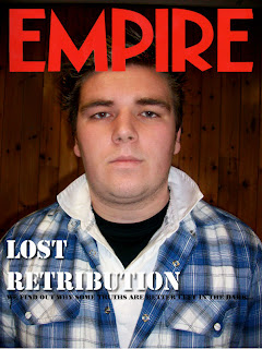 Because I didn't like my previous attempt at creating an Empire front page, I decided to start again, this time using the other main actor from our trailer. I decided to use the background that was already on the photo, as I felt that it was plain enough to use on an Empire cover. I touched up the photo, for example changing the levels, and using the healing brush as well as the burning in tool to make it more useful as an Empire cover. I then started to create titles, starting with the main title about my film. I changed my mind about using red as I though that it wouldn't look right if I used red because of the colours within the photo. I also thought of a headline that I thought worked well for an issue of Empire, telling the audience that if they read the magazine they will find out what we think in response to the headline. Although I was relatively happy with this attempt compared to my previous go, when talking to my peers, they felt that it didn't work as an Empire issue, mainly due to the fact that I hadn't cut out the photo and put it onto a different background. Because of this, I attempted to cut out this photo, as I felt that it was a better photo to use than my previous choice, however I couldn't cut it out to an appropriate standard due to aspects such as the background and the actor's hair. After this second attempt, I changed my idea completely and switched to creating a Sight and Sound front cover, as I thought that I would be able to create a more convincing media product, that would look closer to a professional media text.
Here are the stages I went through to reach my final magazine cover. Click on each picture to enlarge it and read my notes.


After several times at re-strating my magazine, I was finally happy with my end result. I think the image I chose to use was the right choice for a Sight and Sound magazine, as one of their conventions is to use an image that has been taken in a location, and then use the whole image on the cover of each issue, as opposed to Empire who cut out their photos and put them onto new backgrounds. Although I haven't used many headlines on my own cover, there is a reason for this, with it being that on some Sight and Sound issues that I looked at, the producer's only used the main title as well as the 'Plus' headline. I think this is effective because it draws the audience into buying the magazine to find out what else is in the issue. I also like how they largely focus on one film as opposed to Empire who feature many films on the front cover of each of their issues.
No comments:
Post a Comment