Friday 23 April 2010
My Finished Trailer
Any use of music in this film complies with 'Fair Dealing' under the 1988 Copyright Designs and Patents Act (UK), Sections 6(i) and 6(ii); Fair dealing is a term used to describe some limited activities that are allowed without infringing copyright. Briefly these are as follows:Section 6i. Research and private studyCopying parts of a literary, dramatic, musical or artistic work or of a typographical arrangement of a published edition for the purpose of research or private study is allowed under the following conditions:· The copy is made for the purposes of research or private study.· The copy is made for non-commercial purposes.· The source of the material is acknowledged.· The person making the copy does not make copies of the material available for a number of people.
Thursday 22 April 2010
Magazine
 My final magazine cover (click to enlarge)
My magazine cover was the second of the two individual tasks that I completed outside of lesson time. I worked by the same process as my website, researching existing media texts in order to inform my own media product. In the same way I created my website homepage, I again used Photoshop to create my magazine cover, giving me more opportunity to evolve my skills with the programme. By using the same process as when making my website, I think that I have created a magazine cover that reflects the chosen genre of our film, as well as following the codes and conventions of my chosen magazine. The two magazines that I chose to look at for my research were 'Empire' and 'Sight and Sound'. I chose to look at these because I think they are the two most popular magazines, and both offer a different approach towards the same kind of thing - focusing on films. I also conducted a SWOT Analysis of my skills, prior to conducting my research.
Here is the research I did on each magazine, with notes about aspects that stood out to me on each issue cover. Click on each image to enlarge it and read my notes.


After carrying out my research, I decided that I wanted to create a cover for Empire, because I like the way in which they use backgrounds to help emphasise the photo on the cover of the issue. I also like that they use many different headlines to promote what is featured within the magazine, and think that this was the better option of my two choices to successfully promote my film, with regards to my chosen genre and target audience. With this in mind, I took pictures of both of the actors that were featured in my trailer, as I wanted to used the idea of having a close up of a character from the film, as seen in my Sight and Sound research.

Because Empire use backgrounds on their front covers, I decided to make my own using the stamps in Photoshop. This is the first background idea that I came up with, however I didn't think this would work with the cover that I wanted to create. I thought that the colours wouldn't work with my film because on my website I used a red font, and so to keep contiunuity, I had planned to use a red font on my magazine cover too. I think the pattern was ok, although I think i should have added something else, as there are still quite a lot of white areas, which isn't common with the Empire covers I looked at.
 With this in mind from making my first background, I chose to make a new one. This time I changed the colour scheme, instead using reds and blacks, to match the colour font that I had previously decided to use. Although I think my second attempt at making a background turned out better than my first, I was still unsure whether it would work with my magazine cover, due to wanting to use a red font. I thought that if I used red font as well as having a red background, there may have been too much red, and the cover wouldn't have had the effect that I wanted it to have - to tempt my target audience into buying the magazine.
 Although I wasn't entirely sure if my second attempt at making a background would work, I decided to stick with it and see what I could do. After making my background, I cut out a picture of one of my actors using the magic wand tool, and then put it onto the background. I then did the same with the Empire logo, and then using the layer panel, I moved the layers around so that the photo of my actor was over the top of the magazine title - a closely followed convention of Empire as seen in all the issues I looked at for my research. After doing this, I felt that as a magazine cover this wouldn't work, mainly because I felt that my background wasn't right, and that maybe I had chosen the wrong type of photo to use.
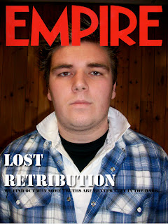 Because I didn't like my previous attempt at creating an Empire front page, I decided to start again, this time using the other main actor from our trailer. I decided to use the background that was already on the photo, as I felt that it was plain enough to use on an Empire cover. I touched up the photo, for example changing the levels, and using the healing brush as well as the burning in tool to make it more useful as an Empire cover. I then started to create titles, starting with the main title about my film. I changed my mind about using red as I though that it wouldn't look right if I used red because of the colours within the photo. I also thought of a headline that I thought worked well for an issue of Empire, telling the audience that if they read the magazine they will find out what we think in response to the headline. Although I was relatively happy with this attempt compared to my previous go, when talking to my peers, they felt that it didn't work as an Empire issue, mainly due to the fact that I hadn't cut out the photo and put it onto a different background. Because of this, I attempted to cut out this photo, as I felt that it was a better photo to use than my previous choice, however I couldn't cut it out to an appropriate standard due to aspects such as the background and the actor's hair. After this second attempt, I changed my idea completely and switched to creating a Sight and Sound front cover, as I thought that I would be able to create a more convincing media product, that would look closer to a professional media text.
Here are the stages I went through to reach my final magazine cover. Click on each picture to enlarge it and read my notes.


After several times at re-strating my magazine, I was finally happy with my end result. I think the image I chose to use was the right choice for a Sight and Sound magazine, as one of their conventions is to use an image that has been taken in a location, and then use the whole image on the cover of each issue, as opposed to Empire who cut out their photos and put them onto new backgrounds. Although I haven't used many headlines on my own cover, there is a reason for this, with it being that on some Sight and Sound issues that I looked at, the producer's only used the main title as well as the 'Plus' headline. I think this is effective because it draws the audience into buying the magazine to find out what else is in the issue. I also like how they largely focus on one film as opposed to Empire who feature many films on the front cover of each of their issues.
Sunday 18 April 2010
Evaluative Commentary
When creating my own viral campaign, I focused on using existing media texts - websites, radio adverts, magazine covers and teaser trailers - in order to properly inform my own work, as well as create products that would be suitable for my chosen target audience. By doing this, the codes and conventions of my chosen genre - a psychological thriller - could also be used, thus further ensuring that the correct audience is targeted in terms of age, demographic and psychographic factors. By sticking to the codes and conventions of the genre, the products that I produced were also fully understandable to our chosen audience, making the campaign much more effective as a whole.
With ideas in mind for the trailer i wanted to produce, I researched texts of a similar genre to the one my group had chosen, focusing on the trailers of 'Cloverfield' (Matt Reeves, 2008), 'Inception' (Christopher Nolan, 2010) and 'Inglourious Basterds' (Quentin Tarentino, 2009). The aim of the trailer I intended to create was to portray an enigma that my chosen target audience would find interesting, and would entice them into going to see the film. The whole 'Cloverfield' campaign is similar to the one I had to create in terms of the fact that it was also a viral campaign that mainly promoted itself over the internet, creating a huge buzz, however both 'Inception' and 'Inglourious Basterds' also used techniques which tempt the audience into watching the film. Although as a group we wanted to produce a trailer that looked as professional as possible, it proved challenging due to the fact that in order to make the campaign as good as a real media product, we would need money and lots more time, as well as many more skills in terms of software and equipment.
We decided to use different aspects from each trailer we looked at for our research, as this would ensure that we would stick to the codes and conventions required for our chosen genre. The idea of having speech throughout the trailer, with visual elements matching up to it was taken from the 'Inglourious Basterds' trailer. I think this idea works well because whilst showing the audience different scenes from within the film, through cross cutting of a speech by one of the main characters, the narration describes the visual elements, helping the audience to understand more about the plot of the film. The 'Inception' trailer has music running throughout it, and we chose to use this aspect in order to help create tension - a vital convention for a thriller trailer. We decided to have a steady tone, increasing in volume as the trailer progresses, with bass drum beats at specific times to give the idea of a heartbeat that increases as the tension heightens. We chose to use some of the same camera angles as those used in the 'Cloverfield' trailer, such as point of view shots. Early in the planning stages, we decided that we weren't going to show the antagonist to the audience as we felt this would help us when building tension, and so camera angles from the antagonist's point of view would help to keep the audience's attention throughout the trailer. For the same reasons, we also decided to use hand held camera shots within our own media product.
When we chose to create a thriller film, we already had an idea of the codes and conventions we would need to use in order to successfully portray our film within the chosen genre. Although this was the case, there were still further codes and conventions that we drew from looking at our research. For example, we knew that music would be a common theme within films of a thriller genre, which was confirmed when the research was conducted, however I personally learnt that the film would be more appealing as a thriller if the music were to increase in volume as the trailer progressed, in order to help create high tension. Another convention that we followed was to not reveal who or what the antagonist within our film is, with the example from our research being the ‘Cloverfield’ trailer. Although this is a similarity between our own media text and an existing media text, a way in which we changed the convention to suit our idea was to imply that the antagonist was there throughout the trailer and this, along with our use of music, sound effects (bass drum) and speech, helped to build tension. Throughout the trailer, we built tension using these elements, with the aim for this to come to a climax, with the last shot where the male protagonist and the camera run into each other. In complete contrast to this high tension, we then decided to end the trailer with the female protagonist repeating a question that was asked earlier in the trailer, but this time with an answer. I think this is really effective because the trailer goes from having high tension to being calm, and ending with a question, which I think would make it memorable to the audience and cause them to think about the film.
 For our individual tasks, I chose to start my website before my magazine. I conducted my research in a similar fashion to the research we did for the trailer, specifically looking at ‘A Nightmare on Elm Street’ and ‘Shutter Island’ as examples to base my own text on.
I was comfortable using Photoshop to create this aspect of my viral campaign, as I am used to using this software as part of my other studies, however I was still able to draw on the new skills I had acquired from workshops that were specifically for webpage design using the programme. This, along with my previous knowledge, meant that I was able to create a product that I think successfully promotes my film.
From looking at these sites, I was able to again draw on codes and conventions that should be applied to a film of the thriller genre. Previous to conducting my research, I had decided to use a dark colour scheme in order to emphasise the chosen genre of my film to my target audience, showing fear and helping to create tension. From looking at websites for existing media products, I was also able to make my own website look as professional as was possible with the software and knowledge available to me. Both ‘A Nightmare on Elm Street’ and ‘Shutter Island’ use the same technique when placing the title of their campaigns along with release dates. This was a convention that was new to me because before starting my research, I had intended to put this information at the top of my website, along with my links. However, after trying to challenge this convention when creating my own site, I decided to instead conform to it and place my title and release date in a similar fashion. This is because it worked better placed in the centre of the page, as when the audience look at the site, it is then the first element they see, and so it becomes memorable, rather than being put in a corner where it then becomes forgettable.
A convention of the ‘Shutter Island’ website was that one of the pictures of a main character that was featured on the homepage was placed off centre. I think this looked really effective, and so chose to adopt this element into my own piece. I then developed this convention by using the picture to play on and reflect the meaning of the tagline to our campaign. By placing the picture off centre, I was able to play on the tagline “Some truths are better left in the dark” by leaving the area next to the picture black.
Another convention that was featured in both of my research examples was the inclusion of legal information, or credits. As this was used in my examples, I felt that I should include this on my own website in order to increase the overall professional look of the site, as well as show the rating of the film, and who was involved with which aspect. I also noted that on both of my examples, there were links to social networking site. I felt that it was important for me to include these on my own site as the brief was to create a viral campaign, and so by including these links, it would enable the target audience to share the website with other people, meaning it would reach a wider range of people and eventually become viral.
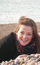
 When creating my magazine cover, there were also codes and conventions that I stuck to from looking at my research. Originally I decided that I wanted to make a cover for ‘Empire’ magazine. I felt that this would be the best magazine to promote our film because of my chosen target audience. The ideal audience member for my campaign would be an adolescent male, who is interested in activities such as social networking, games, films and music. This made me think that ‘Empire’ was best suited for my film because their target audience is similar to mine. With this in mind I began to make my magazine cover for ‘Empire’, however as the process continued, I found there were problems that would stop me producing a media text that I would be happy with and that promotes my film in the way that I wanted it to. The main thing I had problems with was finding a suitable background to use, as one of the main codes and conventions that ‘Empire’ follows is to cut out their photos and put them onto a coloured background. Because this was an important convention, I felt that if I was to make an ‘Empire’ cover, then I would need to follow this, however I had problems when trying to cut out my actor in Photoshop, as well as making an effective background. Because of these problems, I decided to change and create a cover for Sight and Sound. I think this worked really well in the end because I was able to stick to the codes and conventions of the magazine, which enabled me to create a media text that was as close to a real product as possible. I think I stuck to the codes and conventions of Sight and Sound magazine as closely as possible, for example I used a whole photo for the background to the magazine cover. I like this because it meant that I could include the location of the film, as well as both protagonists on the front cover, meaning I could tell the audience as much as possible about the film in a limited space. Another convention of Sight and Sound that I followed was the minimal approach to headlines that are featured on the cover of each issue. On some of the examples that I looked at in my research, the only headlines that were featured on the cover were the main title focusing on the featured film, as well as a ‘Plus’ headline with several headlines underneath it about other articles that are featured in the issue. I followed this convention because I felt that it would enable me to promote my film in an appropriate and effective way, through using simply one headline and a picture showing different aspects of my film.
To accompany the trailer, we had to create a magazine cover, website homepage and radio advert. This helped to make the campaign as a whole have more effect as a viral campaign, as these are texts that will be easily available to the target audience of the media product. The idea of having a combination of different texts in order to promote one product is to make the audience more aware of the product through advertising it to them in different forms. The desired effect of this is to make the product memorable to the audience, through use of taglines, logos, characters, or other memorable elements, therefore tempting them into going to watch the film in order to find out more about it.
My interpretation of the brief was to create a film trailer as the main product, and then produce the three other texts in order to accompany the trailer, and for them to help promote the main media product in the way I think is the best for our chosen target audience. Because of this, I had to use certain elements throughout each of my media texts. This helped create continuity, as well as making the campaign memorable to my target audience in order that they go and see the film or consume the other media products I created. In both my trailer and website homepage, I decided to use the tagline to the film. I think it is a memorable tagline, and so to use it in both of these elements creates a feature of the campaign that is memorable to the audience. The reason I haven’t used them in my radio advert and magazine cover is because I don’t think it would have been appropriate to include them. The reason for not including it on my magazine cover is because on the covers of Sight and Sound that I analysed for my research, no film slogans were used, and so if I were to use mine on my own cover, I think it would go against the conventions of the magazine and so wouldn’t truly reflect an existing media product. I also didn’t use the tagline for the film in my radio advert, for the same reason. I don’t think it would have fitted with the rest of the radio advert, because of decided to use a rhyme as the main speech element for the advert. I think that if we were to add the tagline into the radio advert, it would have sounded out of place, and would have taken away from the effect of the rhyme that we used. I also decided to use a heartbeat within the radio advert, as I think this helps to emphasise the genre of the film by building tension. As well as this, we chose to use the beat of the bass drum, as we did in the trailer. This again adds to the continuity aspect, and adds to the tension that is created because it is a distinctive sound that you would expect to hear within media texts relating to this kind of media product.
A strong and obvious convention of a thriller genre film is to create tension and build it throughout the media texts. This is because the audience know what they expect from a thriller genre film, and so will want to see this throughout whatever media products that advertise the film that they see. In order to conform to this code and convention, I used dark colours in my website homepage, which I think works well with the dark lighting in my trailer, and I also used red coloured font on the homepage to evoke the idea of fear. I think the photo I used on my magazine cover reflects a thriller genre film because of the positioning of the characters. I chose to have the female protagonist looking at the camera, and therefore the audience, because I wanted to show that she is more vulnerable than the male protagonist, which reflects the common stereotype of women being weaker than men. In contrast to this, I chose to have the male protagonist looking away from the camera to show that he has more dominance throughout the film. I chose to have them back to back at the left edge of the frame to show that they are a team, and are both protagonists, and I edited the sky in the photo to give it a more dramatic effect. I think this again reflects that the film is a thriller because you would expect the environment that the film is set in to be dark, and by having a dark, cloudy sky, it would generally evoke the idea that something bad is going to happen in the film, due to the bad weather.
In terms of how well each element of my campaign work together, I think they do work well as a package. This is because although each element is different in some ways, for example the different aspects I chose to use in each text, they all show the film in the way I want them to. For example, I think they all show tension, reflecting the genre of the film, and I think they all successfully target my chosen audience for the film. I believe that if the target audience were to consume one product from my campaign, then they would instantly recognise the brand if they were to see my other texts in other places. For example in my visual texts, I have used photos of my two main protagonists, and so they will be easily recognisable when they are seen in different places.
 As part of the evaluative process, I got a range of audience feedback from members of our target audience. When I got some of my audience feedback, not all of the components of my viral campaign were fully completed, however I still think there was enough to get some feedbakc that was valuable. When all of the components were then finished, I again got audience feedback on my viral campaign as a whole package.
When my first audience member looked at both the film trailer and my finished webpage, they came to the conclusion that the two components worked well together. The main conclusion I drew from this that my audience member felt that the right codes and conventions had been used, in terms of colour schemes and audio. From this first piece of audience feedback, a criticism of the work is that the text could be a bit bigger. I think this is a valid point because if the text were to be bigger, it was be more dominant in the frame, and therefore would become more memorable to the audience. However, I also think that if the text were to be too big, then it would distract from everything else within the frame and would look amateur and out of place.
 I did the same with a second audience member. Although this audience member was a female, which doesn't directly match the target audience we catered for, which is male, I think that it is still relevant for females to see our campaign because there is a small proportion that may be interested in our film. With this is mind, I showed her the trailer and my website homepage and asked her what she thought. The feedbakc that she gave me showed that she thinks the two elements of the campaign work well together, and she likes the choice of colours that have been used in both elements. She also thinks that the two components of the campaign work well together, in a similar way to my first audience member.
Technology has played a big part in the construction of my viral campaign throughout the whole process. I have used many different programmes and techniques in order to complete my campaign, which has meant that I have learnt lots of new skills, as well as being able to develop skills that I had already previously acquired. During the research process, the main technology that I used was the internet to analyse existing media products, as well as to help with my genre and audience research, which was straightforward. In order to present my research for my magazine and website in a different way, I decided to take print screens of my chosen research, and then take them into Photoshop and do my analysis by putting annotations onto the image, then flattening it and uploading them onto Blogger. This was a new method for me, and I think it worked really well. As well as being effective, I think it is a better way to present my research as it makes everything more interesting due to it being more visual rather than a vast amount of writing. As well as this, I also found it easier to explain myself when analysing my research because I could point to specific aspects on the piece of research, rather than try to explain them in a big block of writing. I found this method much more interesting to do, and also much more interesting to look at.
Throughout the whole process of creating my viral campaign, I have been using Blogger to track my progress. I had never used this technology before so I had to learn how to use it. Although it is relatively simple to use, I still had to get used to how it worked, and how to do extra things such as embed video and make links to my other work. I think this has been a really good way to show the process of creatinig my viral campaign because I have been able to upload and write about everything as I have been doing it. I hav
When constructing my viral campaign, I used a variety of different media taechnologies to make my media texts look as professional as possible. When editing my trailer, Adobe Premiere was used, which was another piece of new software that I had to learn to use. Last yea
 r, when editing, Windows Movie Maker was used, which is a simpler programme, with similar features to that of Premiere. The group had the choice between these two programmes to edit this years work, however our group decided to use Premiere. This was because we wanted to learn new skills, and felt that by using a more advanced programme, we would be able to produce a film that looked more professional. Another reason behind choosing Premiere over Windows Movie Maker was because we had an idea of what effects we wanted to use in our trailer to make it seem as realistic as possible, and we felt that Movie Maker wouldn't be able to provide us with the effects we wanted. When we started to use Premiere to edit our film, I found it relatively simple to use. It worked in a similar way to Movie Maker, so all we had to learn was how to apply the different effects, as well as some other small things. I like that we were able to change some of our shots to black and white without the quality being changed, and also that we could add in the effects we wanted, such as the white noise and the still shots I made in Photoshop.
 Another new programme that I used in order to complete making my viral campaign was Adobe Audition. I used this programme to edit together my radio advert. This again was a new piece of technology that I had to learn to use, however I picked it up quickly because in some ways it is similar to both Photoshop and Premiere. We didn't want to do anything drastic to our radio advert, so it was mainly just a case of putting the different sound clips together, and cutting them down. The main thing we had to change was the heartbeat. The original clip didn't sound like we wanted it to, so we had to cut bits out in order to make the rhythm we wanted. As well as this, we changed the speed of the clip in order make it more effective. This also helped us to create tension within the radio advert because we made it quicker. With the other sound clips, the main thing we had to change was the volume. This was so that all the different sound tracks could be heard, but the effects, such as the heartbeat, weren't louder than the speech, which was the most important element.
During the evaluation process, I again used Blogger to present my work. As well as this, I also used the internet to find the right logos to represent each programme I used throughout making the viral campaign.
In comparison to the coursework I produced for AS, I think this has turned out much better, and as a whole I am much happier with what I have produced this year, compared to last. I think this is beacause the dynamics in the group were much better, and I worked better with thisyears group members. I also think that this years work was planned much better, which I think was vital because there were four different components that needed to be completed. This meant that time management was vital because everything needed to be completed on schedule, and we had to allow time for shhoting and editing, which had the potential to take longer than planned incase there were certain issues that may have arisen.
The main difference between the AS coursework and my A2 coursework was firstly the amount of work that had to be produced for each. For the AS coursework, we had to produce a Preliminary Exercise as well as the opening sequence to a film. This is much different to what we had to produce this year, as this years work involved creating a whole campaign, meaning we had to focus on branding our media product and promoting it in an appropriate way.
Another difference between the two pieces of coursework is that in the AS work, the opening sequence of the film focuses on narrative. This is because with the opening sequence of the film you need to make the audience want to watch the rest of the film, and so by having as much narrative in the opening sequence as possible, this is more likely to happen because it will keep the audience interested in what they are watching. In comparison to this, the A2 coursework focuses strongly on genre rather than narrative. This is because with a trailer you are encouraging people to go and watch the film, rather than trying to tell them too much about the narrative featured within the film. This is because if the audience find out what is going to happen in the film just by watching the trailer, they won't want to go and watch the film. The A2 coursework is all about attracting a target audience, and encouraging them to go and see the film when it is released. It is also about making the audience as aware of the film as possible by using different media forms in order to expose them to the campaign. By doing this, the film will then become more memorable to them, and they will be more likely to go and see it.
Friday 16 April 2010
Trailer Research - Inglourious Basterds
To identify the codes and conventions commonly used in teaser trailers which promote films within the genres of thriller and action.
Case Study:
Inglourious Basterds (Quentin Tarantino, 2009)
Inglourious Basterds used a different narrative structure again when comparing to the other two trailers. Whereas Cloverfield used a short continuous sequence and Inception used various scenes from throughout the film, this trailer used a mix of these ideas. It was essentially a collage of significant scenes from the film held together by one main scene in which the main character played by Brad Pitt is talking to his men.
This tactic allowed them to establish the setting and to some degree the relationship between the men. It also revealed the nature of their quest and some of the ways in which they were going to complete it. This approach is distinctly different to the other two trailers as the audience has been given far more information and as such the enigma is not as strongly established. However, as with all trailers the resolution of the storyline remains a mystery and in some cases such as this that is enough to capture the minds of the audience.
They also edited in a pieces of text in order to further establish the setting and basic storyline. Like with Cloverfield the production companies and other credits were not mentioned on the trailer and it was in fact only the name of the director Quentin Tarentino that was mentioned within the trailer. I believe there is a certain tactical element to mentioning Taentino’s name within the trailer as he is a very well known and distinctive director with a wide fan base. His films are famous for their distinctive style of real and sometimes shocking depictions of world events, therefore putting his name in the trailer acts as an extra point of promotion from the trailer.
This film used a combination of diegetic and non-diegetic sound which was once again different to the other two trailers which either used completely diegetic (Cloverfield) or completely non-diegetic (Inception) sound. The diegetic sound in this trailer was primarily Brad’s dialogue which acted as a form of narration to outline the premise of the film. There was also a scene used towards the end in which ‘Hitler’ was shouting ‘nein’ repeatedly which was then followed by Brad Pitt closing the speech to his men. The juxtaposition of these two clips gave the impression that there is a small comical element within the film at least as far as you can make killing and war comical. The non-diegetic sound however was music which used instruments such as bass guitars and other instruments associated with some forms of heavier rock music. It provided a feeling of action and excitement which resembles the shots used to create the trailer.
Trailer Research - Inception
To identify the codes and conventions commonly used in teaser trailers which promote films within the genres of thriller and action.
Case Study:
Inception (Christopher Nolan, 2010)
The teaser trailer for Inception is incredibly different from that of Cloverfield. To begin with it is 46 seconds shorter at just over 1 minute long. It also uses a mix of CGI and traditional film. It follows the more conventional teaser trailer style by skipping through time to particular scenes of action. This method allows the audience to see some of the more enthralling moments within the film and seeing as the job of the teaser trailer is to invoke a desire to consume the text this method is very popular.
Another major difference with the Cloverfield trailer is the fact that no diegetic sound is used throughout. The non-diegetic sound used is a mixture of percussion used in a slow and deliberate manner and a sharp note which increases in pitch throughout the trailer. The pace of the beat alongside the increasing tone of the music was used to build tension within the audience.
The main character which the audience is expected to identify with is clearly established in this trailer in Leonardo DiCaprio. There are a number of close up shots which seem to indicate he is of significant importance within the film. As Leonardo is a well known actor and seemingly the main character, including him in the trailer is likely to attract many of his fans from previous films thus enhancing the success of the marketing campaign.
The additional information provided within the trailer included the production company, Leonardo DiCaprio’s name, a line of text which sets up an enigma, the date of release, name of the film and other noteworthy people and companies involved in the production. This being said little about the film’s storyline was actually revealed again in order to create an enigma. The parts that were shown in the trailer included scenes where gravity itself was being defied, and such an enigma as this will undoubtedly spark the curiosity desired to get the audience of the trailer to watch the film itself.
Trailer Research - Cloverfield
To identify the codes and conventions commonly used in teaser trailers which promote films within the genres of thriller and action.
Case Study:
Cloverfield (Matt Reeves, 2008)
Cloverfield’s whole viral marketing campaign was one of the most creative developments in the use of the internet and the power of social networking in film history. It seemed to use the philosophy ‘less is more’ and by this approach the blogs and fan pages were sent into overdrive.
They essentially managed to create an enigma that captured the minds of the public. This created a buzz which reverberated across the worldwide web in an unparalleled fashion. As such, the film gained huge amounts of below-the-line promotion through word of mouth and speculation on the identity of this destructive force.
The trailer used a short sequence from the film with a few points of ellipsis used to create the timeframe required for the trailer. This differed from many teaser trailers which often skip between different significant points within the film in a manner disassociated with the actual timeline of the film. Within the sequence used there was an establishment of setting particularly when the Statue of Liberty’s head rolled down the street and an establishment of characters to a certain degree though this was very vague. Using such a limited section of the film seemed to be part of the ‘less is more’ marketing strategy as the audience was only given one point of reference within the film from which to try and answer the plethora of questions it left behind. Not even the title of the film was put in the teaser trailer, in fact only the name of the producer J.J. Abrams and the release date were given.
The camera was hand held when filming Cloverfield which acts like a constant point-of-view shot thus allowing the audiences perspective to be more subjective and thus ‘realistic’. They also only used diegetic sound within the trailer which is again fairly atypical of teaser trailers but again it does add to the verisimilitude of the trailer.
The shots often became broken and out of focus in order to denote a state of panic and confusion. The trailer relied on this confusion transferring into the audience for the enigma to be enhanced. Further techniques were employed in order to create this state of panic and confusion for example, the camera was often uneven and in the scene where they were running down the stairs it appeared to go upside down at one point during a near rolling action. In addition to this frequent cuts were used throughout the trailer which gave it a fast paced feel.